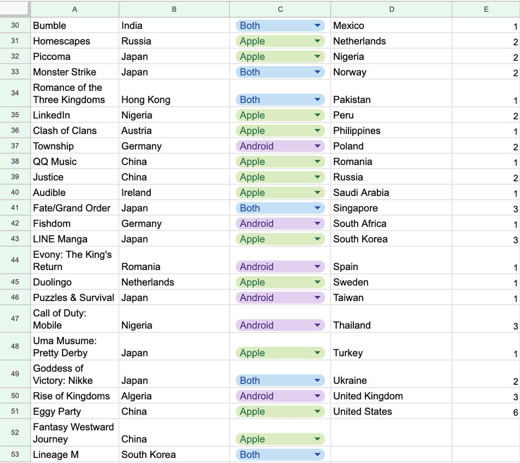
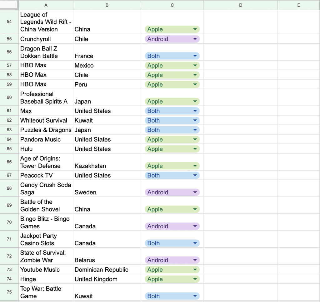
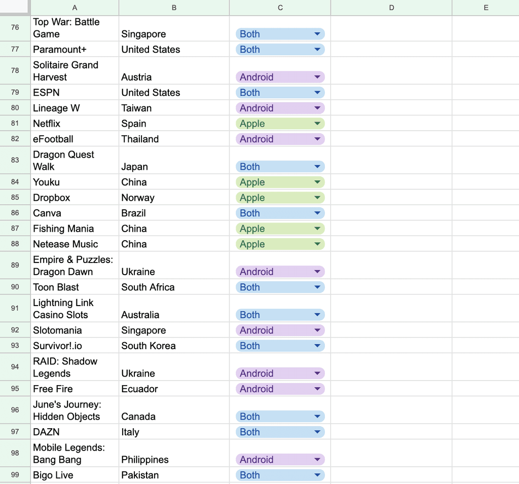
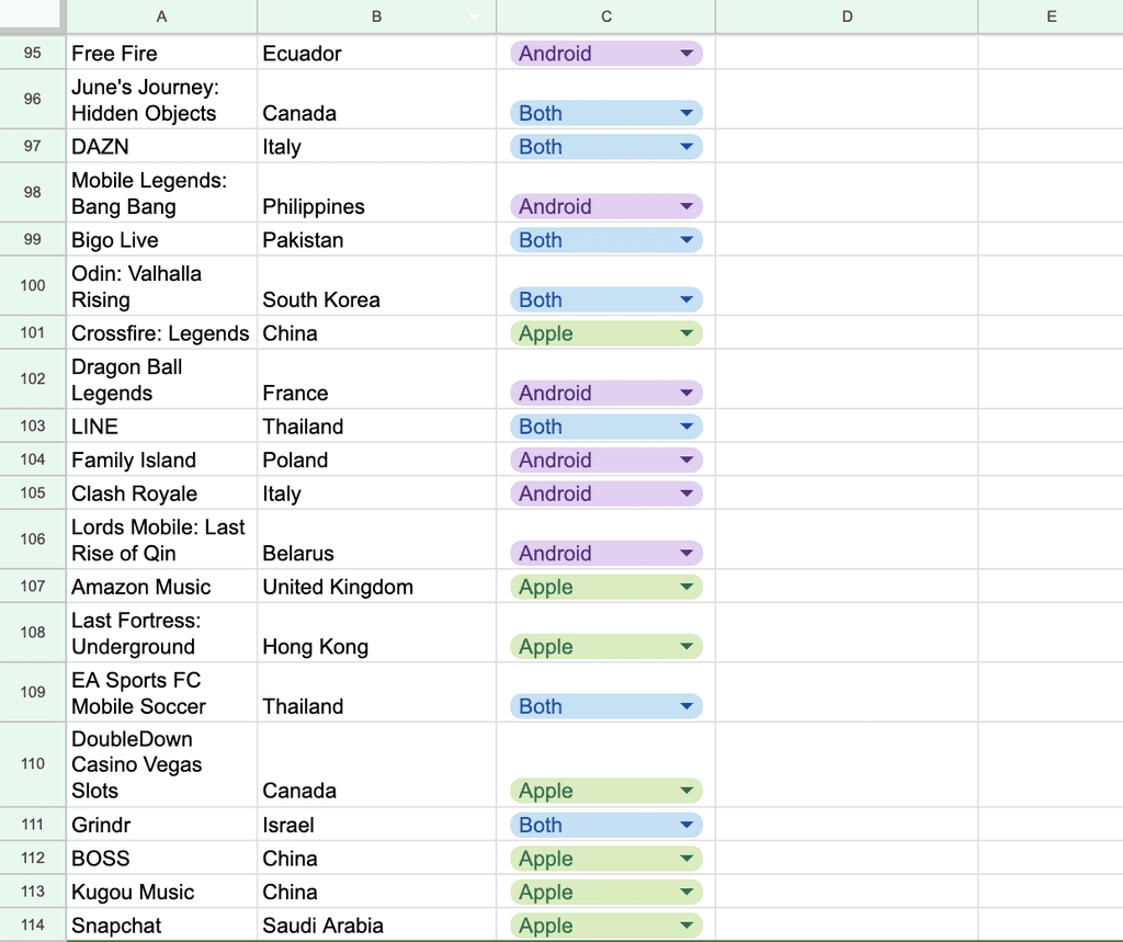
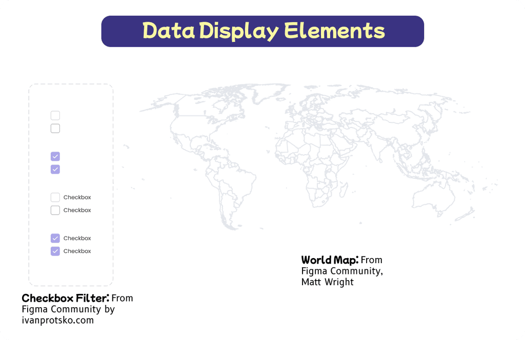
The topic was narrowed down by researching how much or little information there was. In the end Top 100 Grossing Apps was the one with that was easiest to find.
Coming up with the Idea: There were many ideas when I started with this, as well as a lot of research to see what was possible or interesting to me. Ex. Chinese-American Dishes, Top Chinese Languages, or Top Grossing Apps 2023.
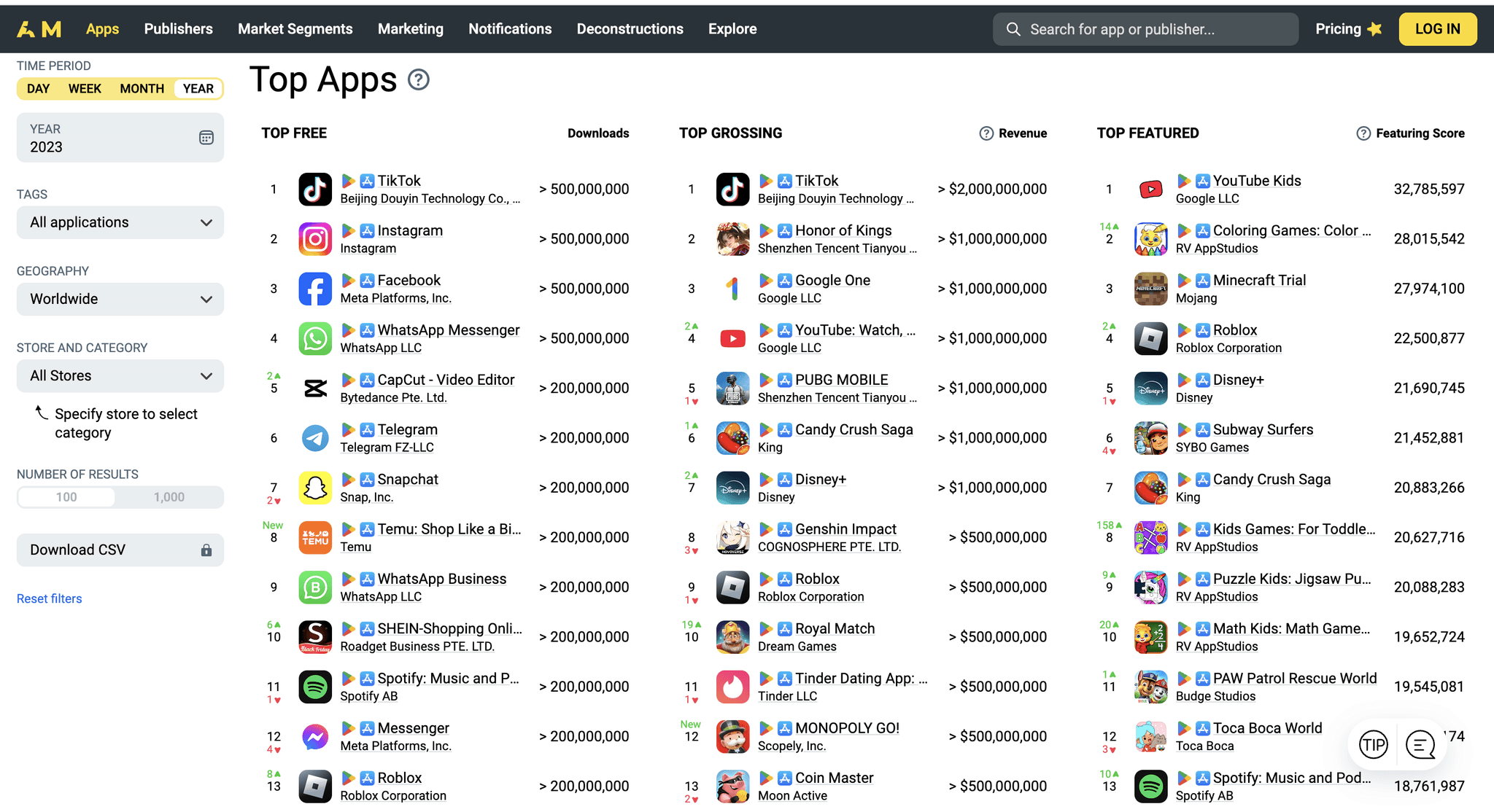
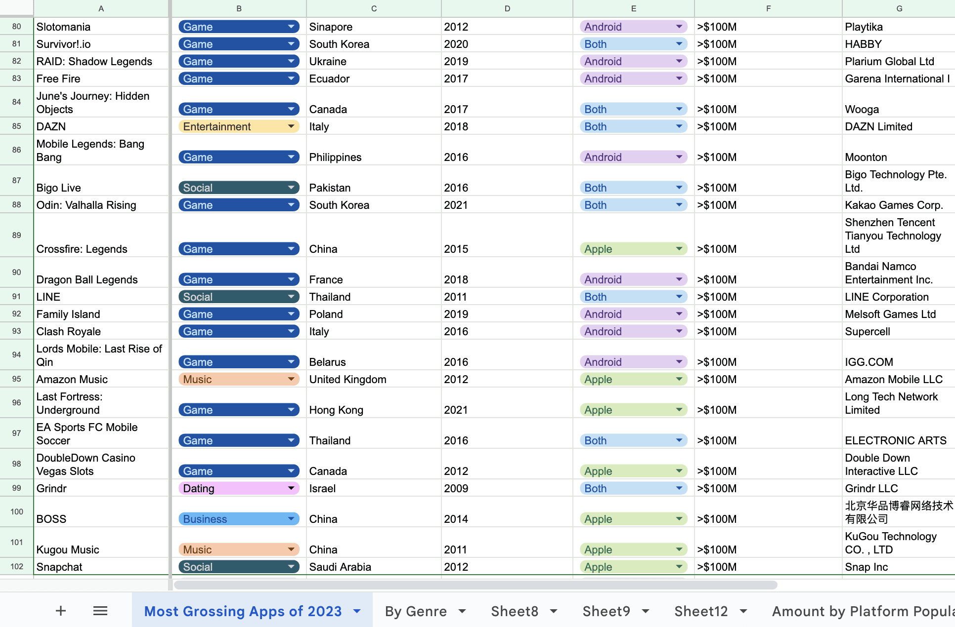
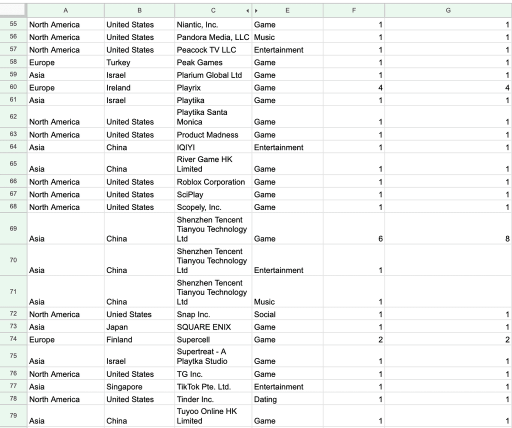
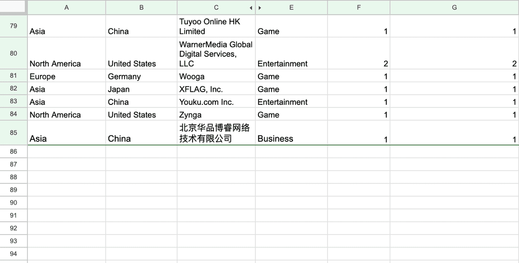
Finding the Data: Gathering this data, whether from various sources or by breaking down analytics on one source, required a mix of resourcefulness and patience.
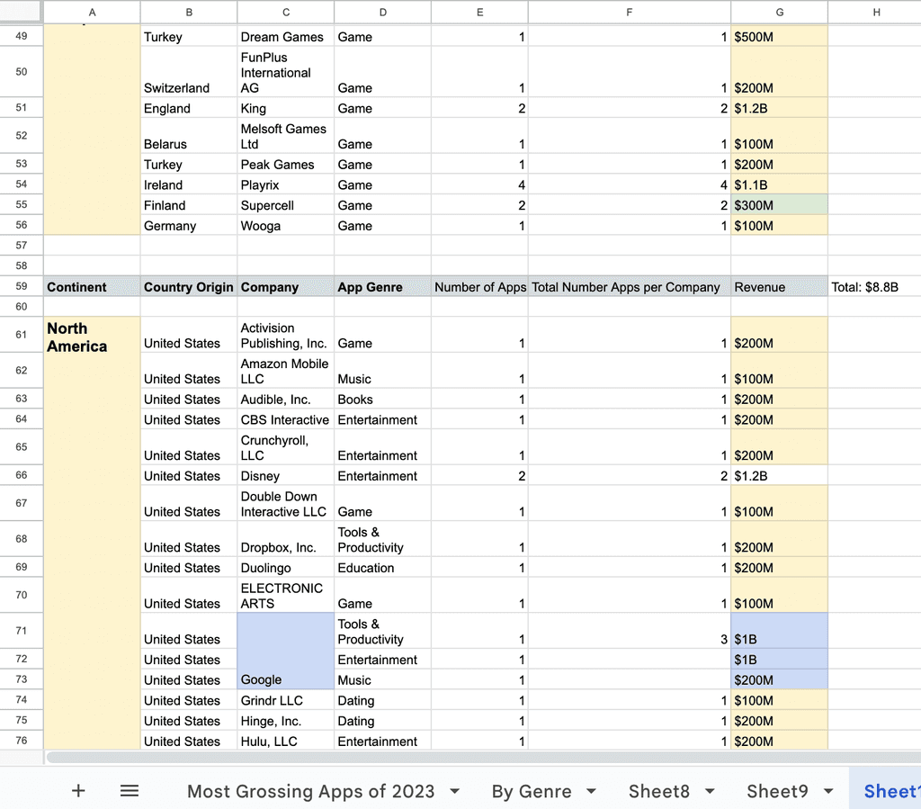
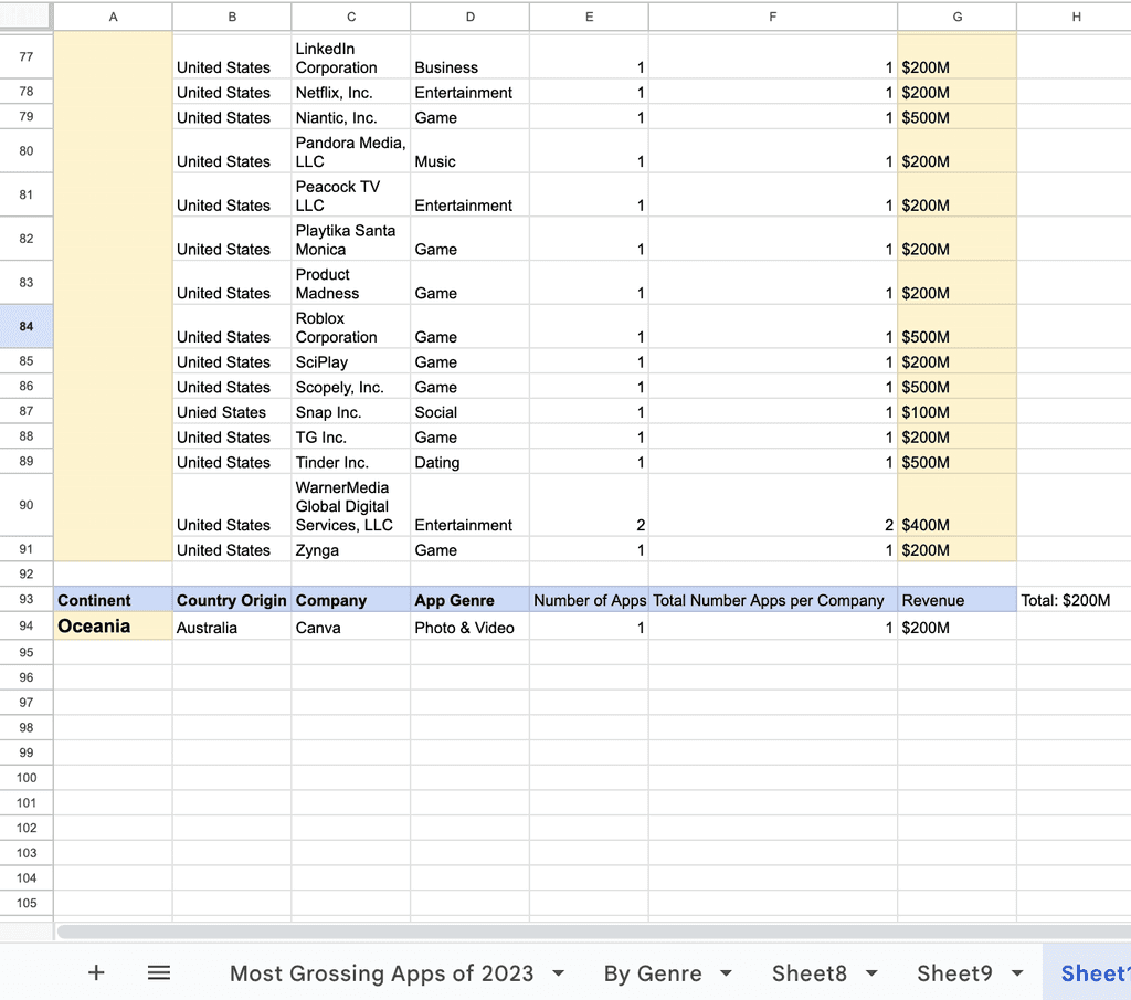
After some web surfing, I found AppMagic.rocks. It provided everything and I just had to look deeper into it to get specific sets I wanted to cover and identify the top countries.
Background
Figma
Data Visualization
Prototyping
Information Architecture
High-Fidelity
Role: Interaction & UX Designer, Information Architect
Timeline: September - November 2024
All Tools Utilized: Figma, Google Sheets, Dayol, appmagic.rocks
Design Goals:
Design an interface to display the data that allows users to connect and discover patterns digestibly.
Design a theme, that feels universal & futuristic to blend the world together.
Digital Dominance
How did I apply it to my Data?
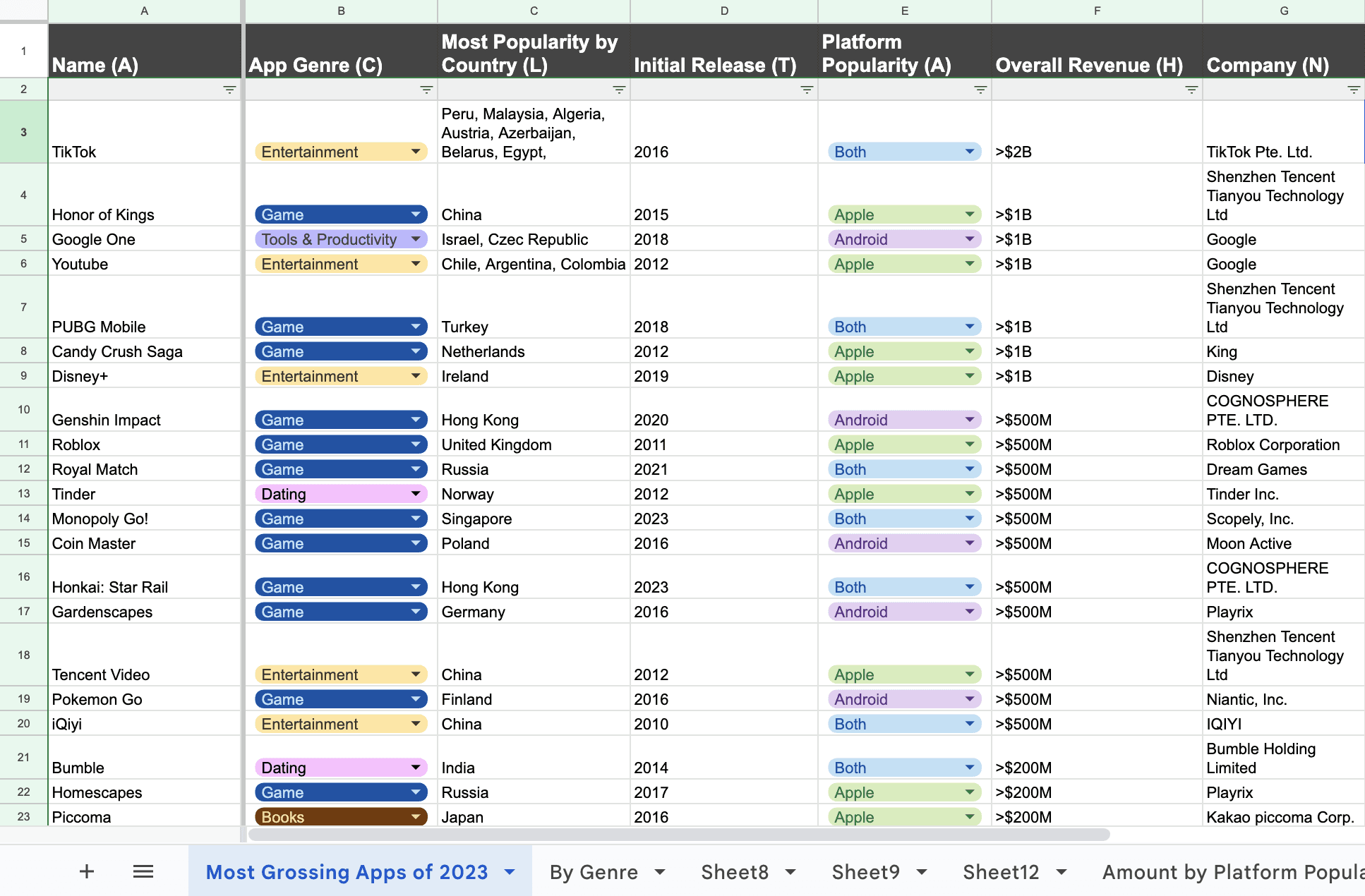
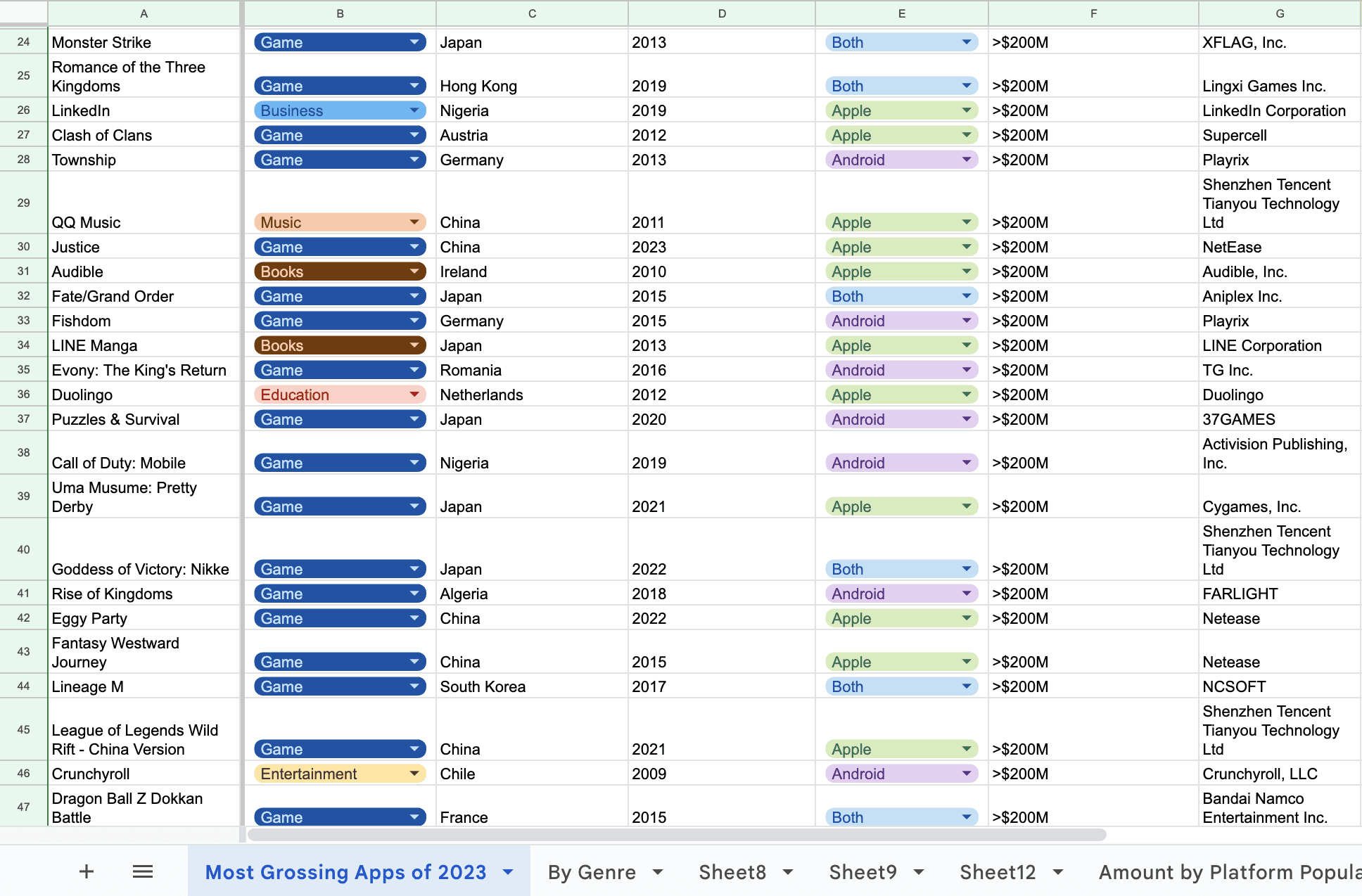
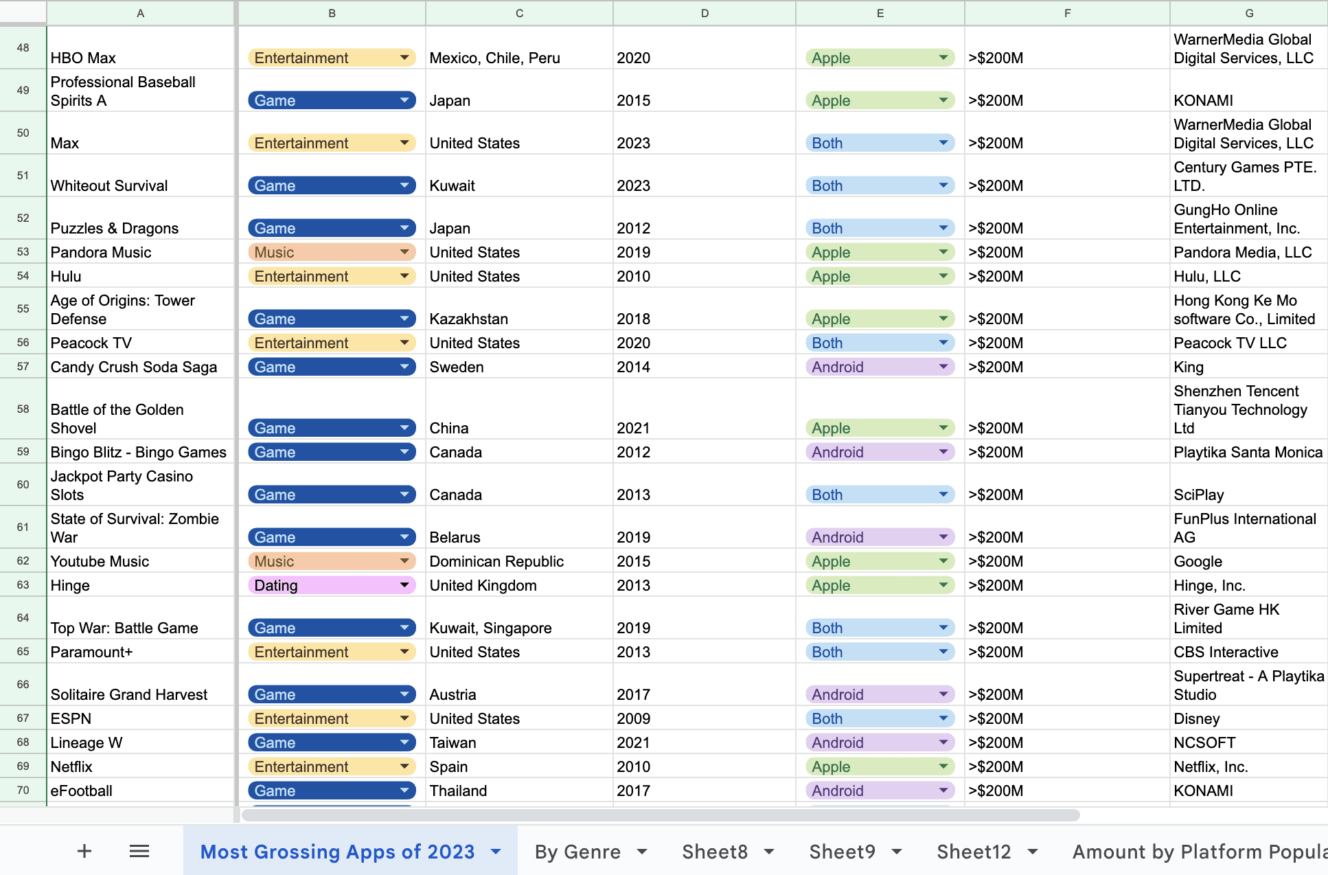
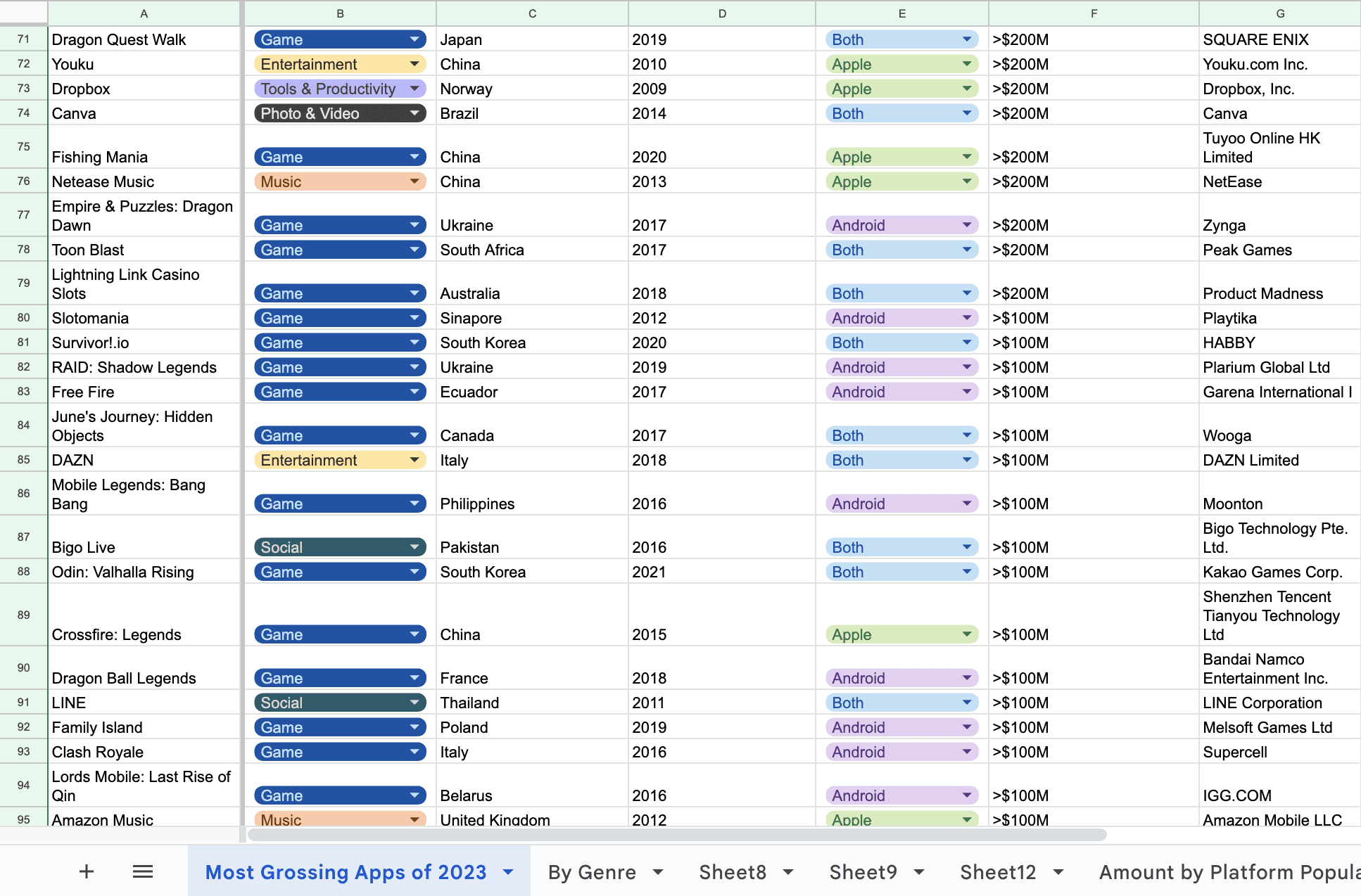
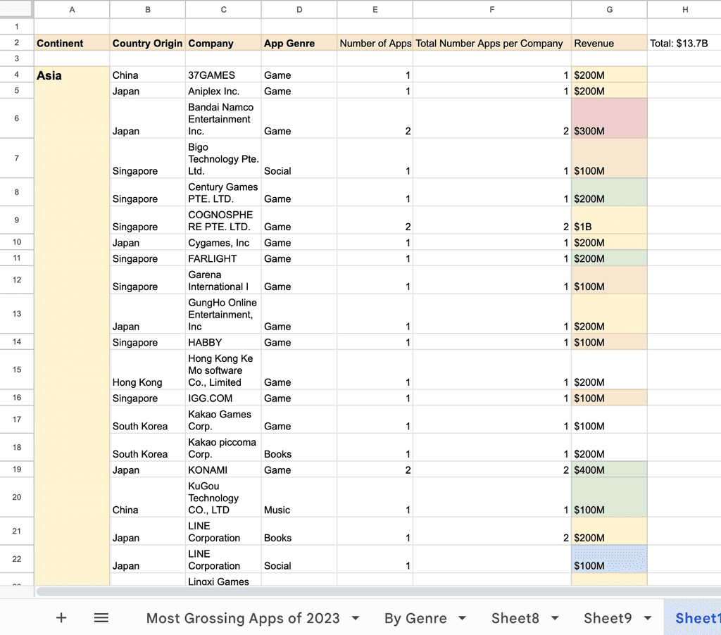
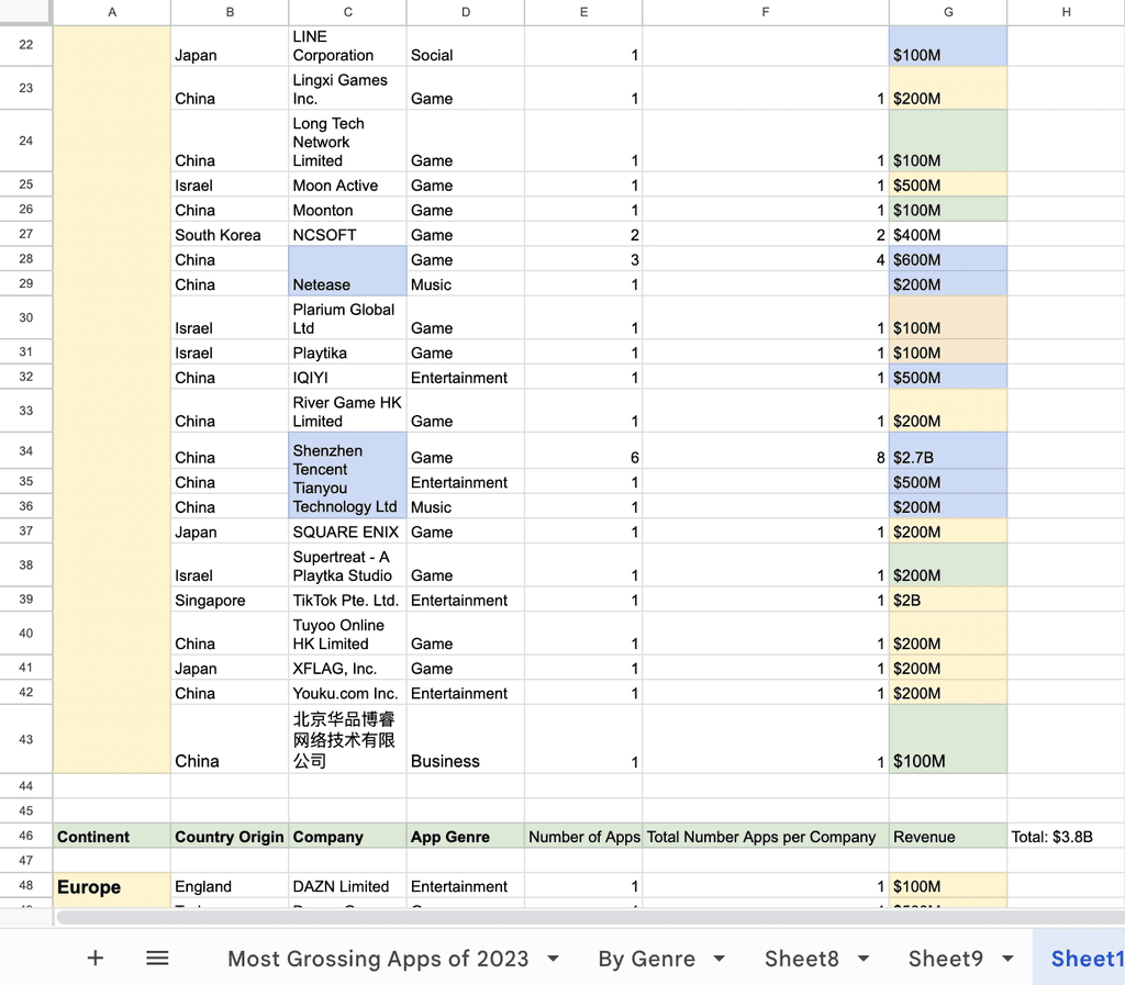
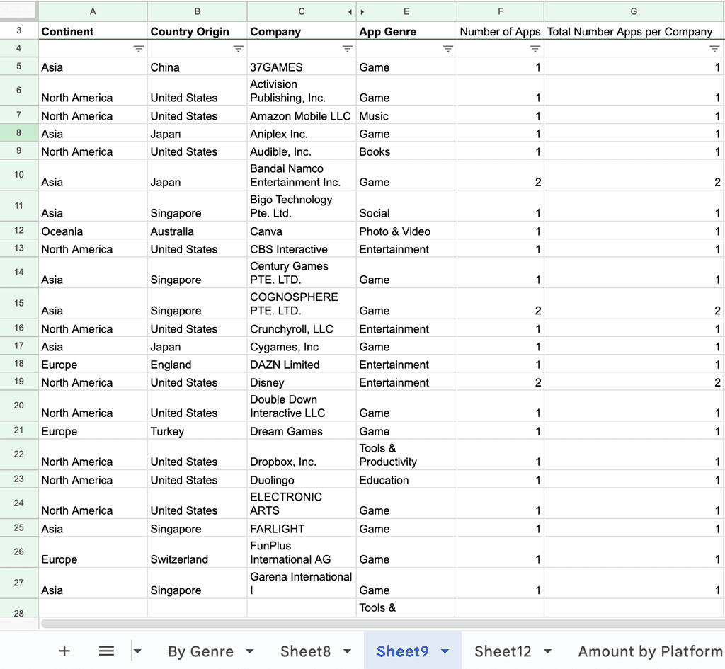
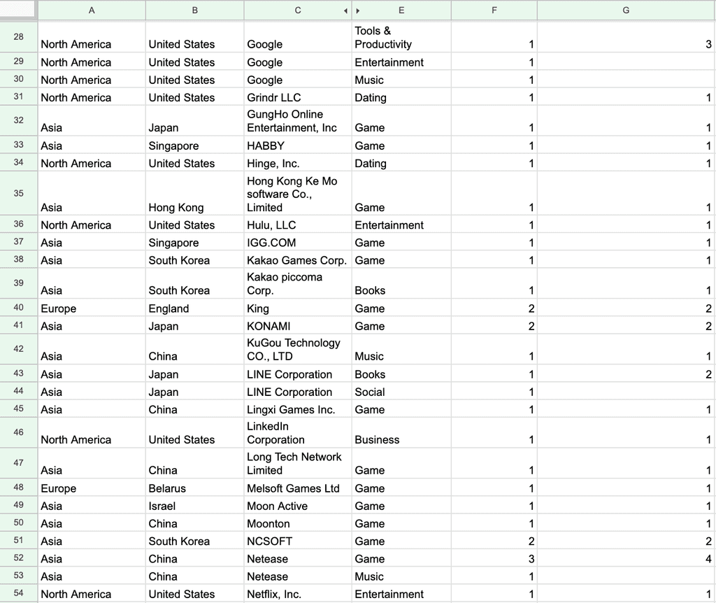
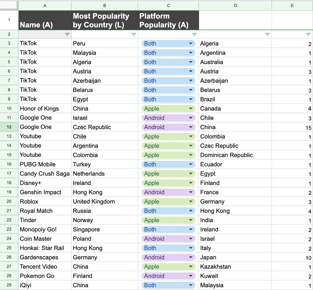
I organized the data into columns on Google Sheets for clarity —
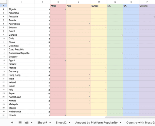
Location: Most popular country by app. This can be grouped by continent for a more holistic view.
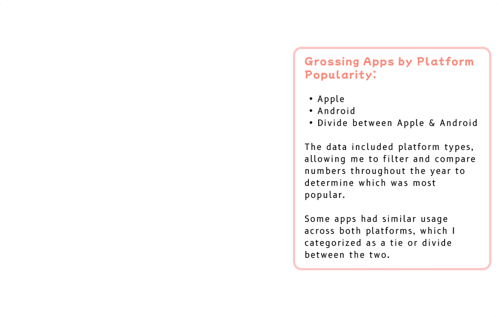
Alphabet: Name of the platform where the app was most popular.
Time: Year the app was released or the year the data is from (2023).
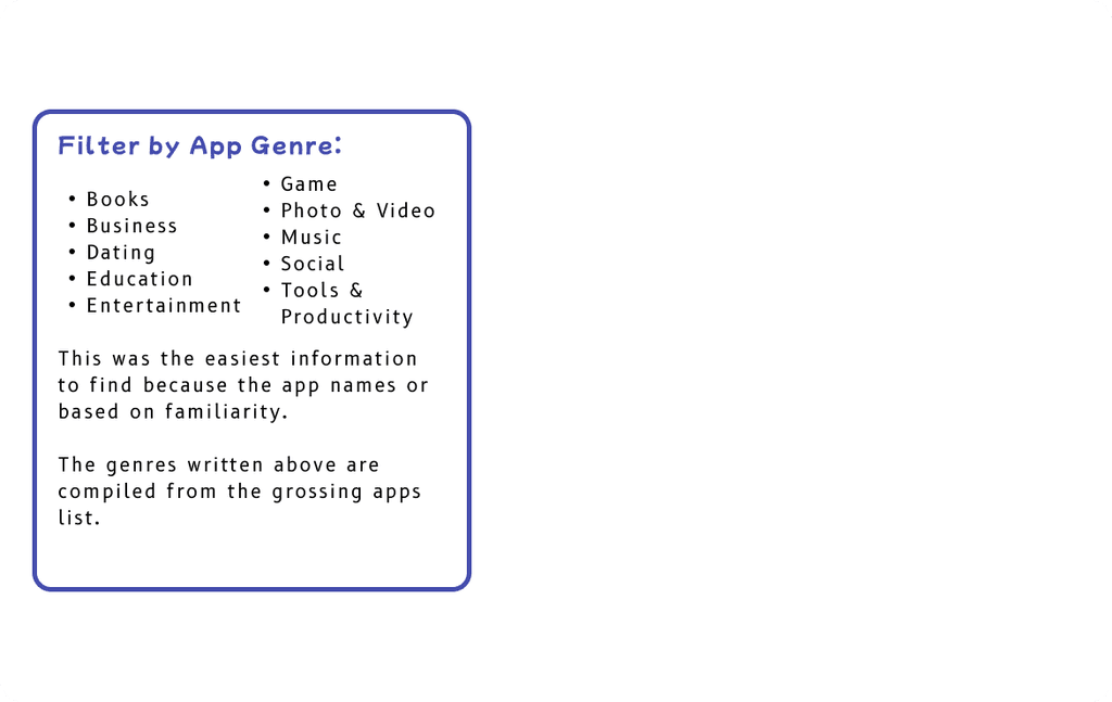
Category: Popularity by app genre.
Hierarchy: Revenue each app made in 2023, which can also be grouped by total revenue generated by each continent for deeper analysis.
What is LATCH?
This method helps organize information based on location, alphabet, time, category, and hierarchy.
It makes it easier to break down large sets of data into more digestible categories to understand and find patterns to display it visually.
Applying the LATCH Method
Project Objective: Build a database collection of 100 items, utilizing the LATCH method to create hierarchical categories to break down the information, and show it in a interactive form.
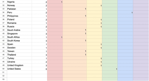
Overall Data can be broken down by:
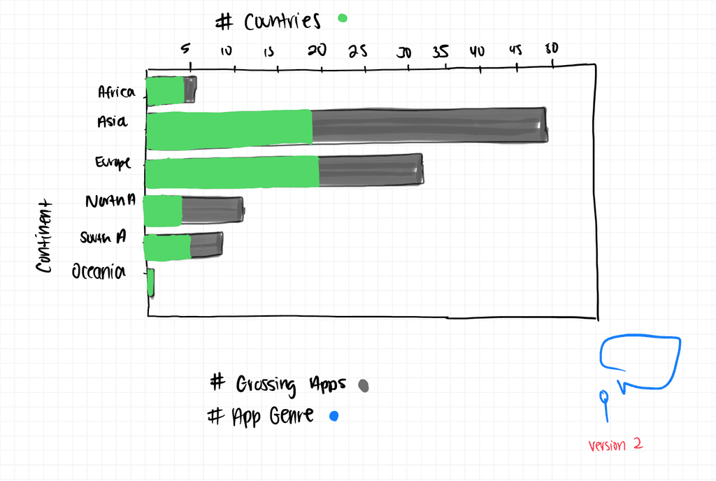
Number of Grossing Apps per Continent
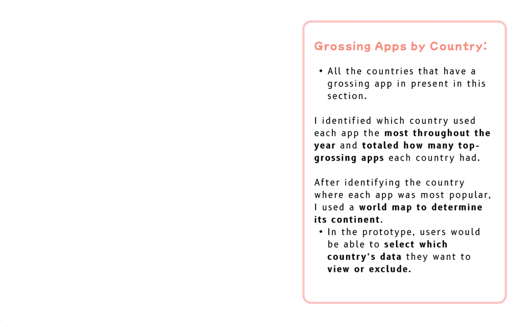
Grossing Apps per Country
Revenue Totals per Continent
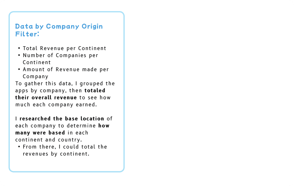
Grouping the Data
User Narrative: Once the data was organized, I drafted a user narrative to envision how someone would navigate the interactive features. (pg. 1).
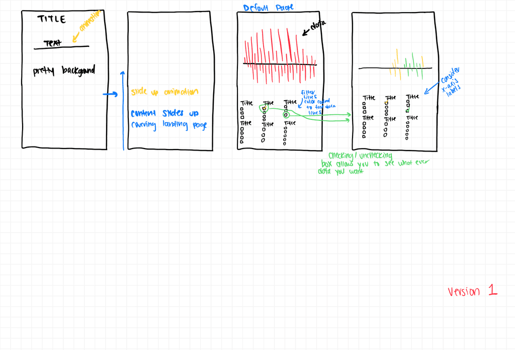
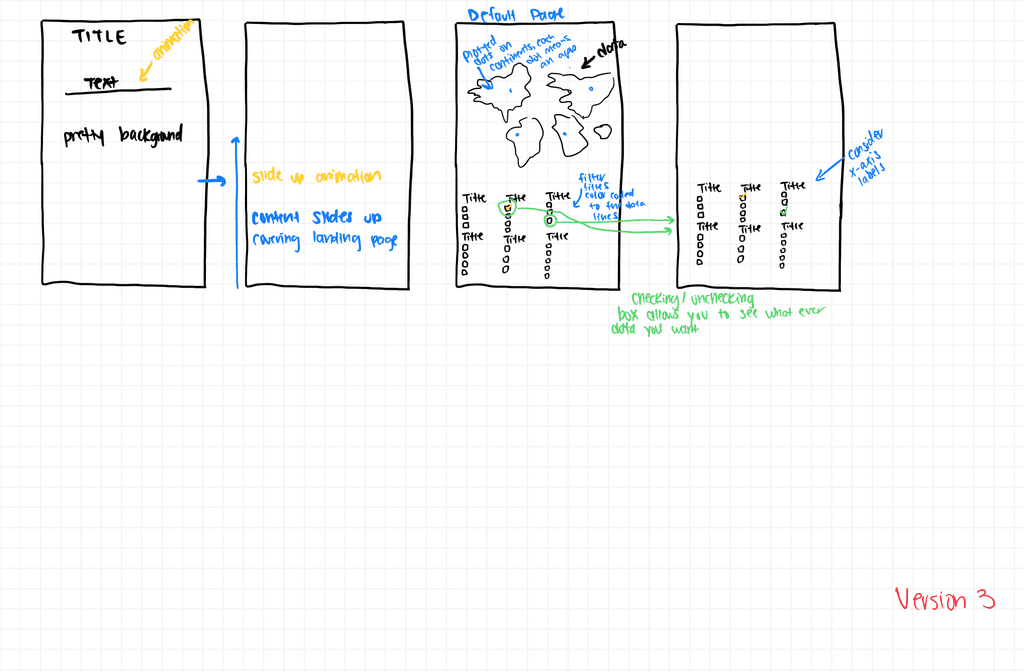
Low-Fidelity Wireframe Sketches: I sketched out a few versions of how to display the data on the prototype and how I wanted it to look. (pg. 2-4).
Narrative & Prototype Sketching
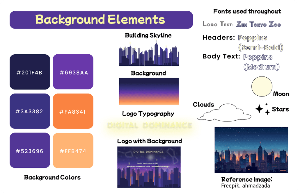
Futuristic Design: When thinking about a theme to pair with the data, I considered what each country has that constantly changes over time—the cities and buildings. I created a nighttime city skyline, capturing the moment just after sunset with a slight orange hue still lingering in the sky (pg. 1).
Data Display: Since the data covers the entire world, I decided to display it on a world map. This way, users can see all the points at once and easily locate them by using checkboxes to turn points on/off(pg. 2).
The Style Guide
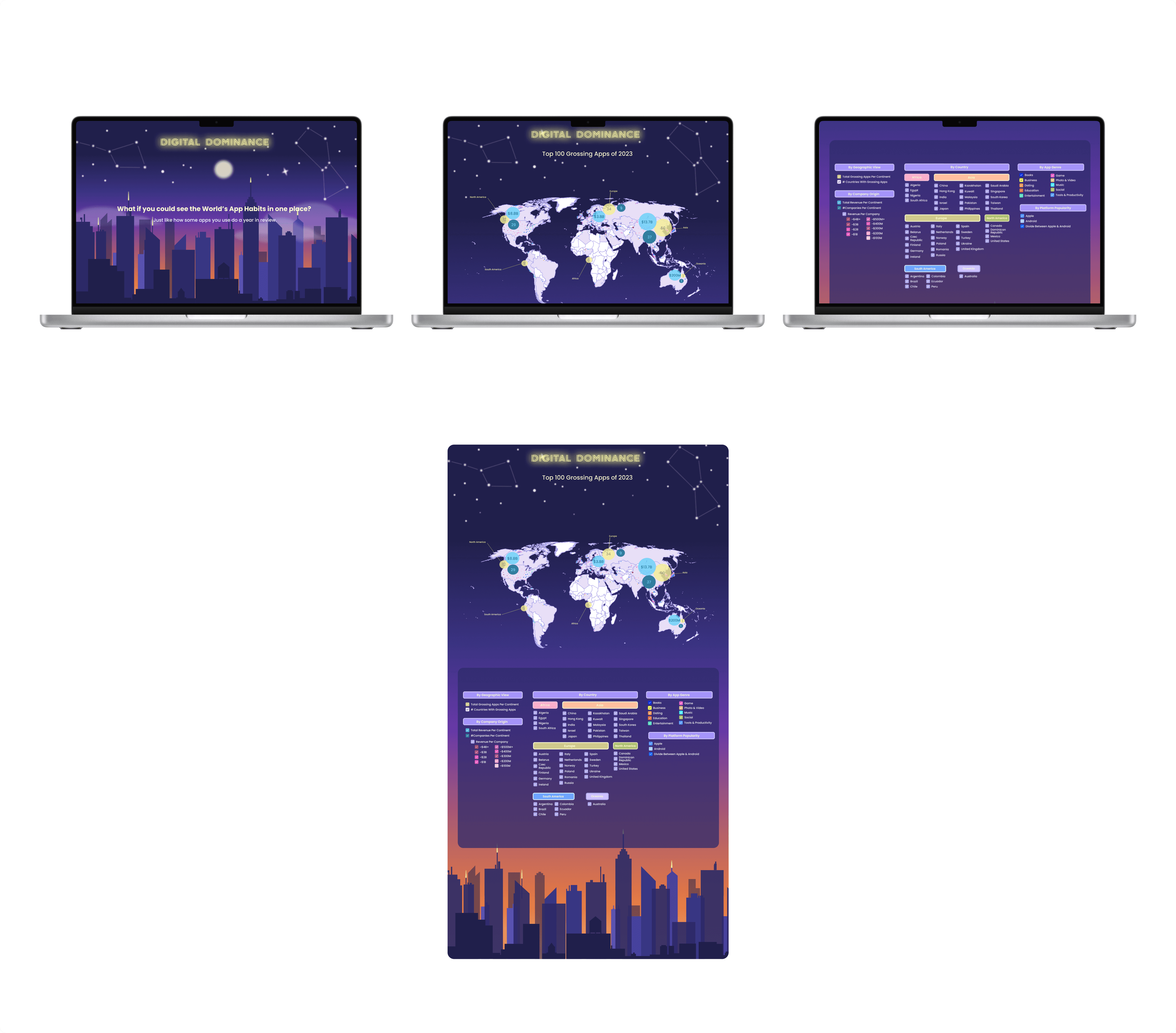
Sketches to High-Fidelity
Challenges: During the early stages of this project, I initially struggled with breaking down the data I collected and presenting it in a way that users could easily understand.
I went through several iterations of display and design before arriving at the final version. After rethinking how I wanted to present the data, I pivoted to a different approach.
Discussing my thought process helped clarify my ideas, and I knew changing directions was the right choice. I wanted the data to be both digestible and interactive.
What I learned: I learned that having too many ideas can sometimes make me lose focus. I also discovered that creating data visuals in Figma is challenging, but it pushed me to explore more of what I can do with graphic design in the tool.
What is next for the Future: I want to explore to see if there are other ways to create visual data prototypes to make the process a bit easier. I would also like to make it easier to see the filter section & data in one view.
Conclusion
